Wordle: 1

Sunday 9 March 2014

Calculating Weighted Average in Excel.

The concept of average comes from mathematics, average can be defined as the result obtained by adding several quantities together and then dividing this total by the number of quantities.
Usually when we calculate average, we put same weight or priority to each value, this is called un-weighted average.
For example, let’s say we want to calculate the average of Marks of a Student in five subjects:
The marks are as follows:
Marks-of-Sutudent-in-5-subjects
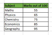
So, we will sum the numbers and divide the result by 5 : (55 + 65 + 75 + 85 + 95)/5 = 75
This is the un-weighted average because in this case we have assigned same significance to each number.

So, what is the Weighted Average then?

Weighted Average is a type of average where item weight is also taken into consideration while finding the average. And because of this one element may contribute more heavily to the final result than another element.
Let’s understand this with the below example:
The marks of the student in 5 subjects are as follows:
Marks-of-Sutudent-in-5-subjects
Now, let’s consider the student want an admission to an Economics college. So, obviously the college will put more emphasis on the Economics marks and hence they have come up with an idea of assigning weight to each subject as follows.
Marks-of-Sutudent-in-5-subjects-with-weights
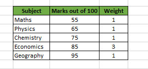
This shows that the college gives 3 times more emphasis on the marks of Economics than another subject, while finding the average.
So, now we find the weighted average of the marks according to the above table as:
((55 x 1)+(65 x 1)+(75 x 1)+(85 x 3)+(95 x 1)) / (1+1+1+3+1)
This comes out to be = 77.85, which is higher than the un-weighted average i.e. 75.
So, in this case the Economics marks have contributed more to the final result than any other element.

How to Calculate Weighted average in Excel?

After understanding the concept of Weighted average in Excel, you must be thinking how to calculate it in Excel.
So, for this you have two methods:
Method 1: Calculating Weighted Average by using Sum Function:
This is an easy method and it requires you to have knowledge of SUM Function. The formula is as follows:
= SUM((1st Element * Weight of 1st Element), (2nd Element * Weight of 2nd Element), … , (nth Element * Weight of nth Element)) / SUM(Weight of 1st Element, Weight of 2nd Element, Weight of nth Element)
Although this method is easier to understand but it is not a feasible option if you have large number of elements.
Method 2: Calculating Weighted Average by using SUMPRODUCT Function [Easy Way]:
This method requires you to have understanding of Excel SUMPRODUCT function. The formula is as follows:
= SUMPRODUCT(, )/ SUM()

An Example on Calculating Weighted Average in Excel:

Below table shows the data from a “Project Task Completion Plan” table.
Project-task-Completion-Plan
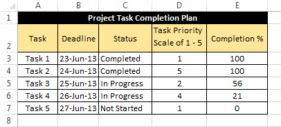
As you can see that, in the above table there are five tasks each one with its own “priority” and “completion percentage”.
So, in this case “Priority” will act as the weight assigned to completion percentage.
Now, to find the weighted Average we can use a formula:
=SUMPRODUCT(E3:E7,D3:D7)/SUM(D3:D7)     [Method 2]
Which results into 61.23
Alternatively, Weighted Average can also be calculated using the formula:
=SUM(E3*D3,E4*D4,E5*D5,E6*D6,E7*D7)/SUM(D3:D7)    [Method 1]
Project-task-Completion-Plan
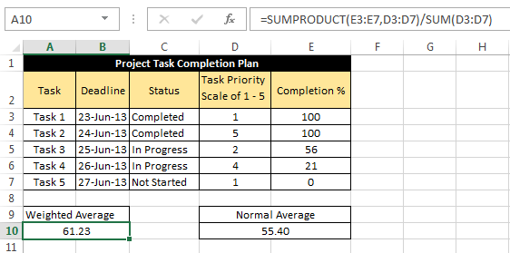
Note: In the above image notice the difference between the result of un-weighted average and weighted average.
So, that was all about finding weighted average in Excel.
Learn more with Excel
Become a Member of Excel Is Fun. :)

10 best new features in Excel 2013.

Almost everyone will find something to appreciate in Excel 2013. It's more functional and easy to use. Everyone's going to love Flash Fill. Experienced number crunchers will appreciate the new data model feature. Inexperienced users forced to get more out of the application than their experience really supports will appreciate Recommended Charts, Recommended PivotTables, and Quick Analysis. The emphasis seems to be on easy access to features that were, prior to 2013, a bit harder to implement. These are the 10 new features that I think will benefits most users.

1. Flash Fill

Perhaps the closest thing to magic Excel users will ever see in a workbook is Flash Fill. This feature anticipates formatting and data requirements by recognizing patterns so it can finish what you start. Figure A shows a typical use for Flash Fill. First, I transposed a record’s name value into last name, first name order. While doing the same for the second record, Flash Fill recognized a pattern and suggested possible entries to complete the column. When Flash Fill displays this list, you have two choices: Press Enter to complete the list or press [Esc] to remove it.
Flash Fill can complete this list for you (Figure A): 

Excel_New_Ftrs.FigA.png

2. Recommended Charts

Most users don't always know the best chart type for their data. Recommended Charts takes the guesswork out of the process. Simply click inside the data you want to chart, click the Insert tab, and click Recommended Charts to see a collection of suggested chart types, as shown inFigure B. Then, click a thumbnail to preview your data as that chart type. Double-click a thumbnail to embed the chart. Using this feature lets you work with confidence knowing the chart will highlight your data in a meaningful way.

Excel_New_Ftrs.FigB.jpg

3: Recommended PivotTables

This feature works similar to Recommended Charts, but generates a quick PivotTable. It’s a great new feature for most users, because so many of us struggle with PivotTables. Click inside the data range (which must have header cells) and click the Insert tab. In the Tables group, click Recommended PivotTables to display the dialog shown in Figure C. Select a thumbnail and click OK to embed an effective PivotTable in a new sheet.

Excel_New_Ftrs.FigC.jpg

PivotTables are a simple as a few clicks and a choice—no more struggling with field lists and table frames!

4: Quick Analysis

Use Quick Analysis to quickly preview your data in meaningful ways. For instance, Quick Analysis offers a second new way to generate appropriate charting for your data. Select the data and then click the Quick Analysis icon at the bottom-right, as shown in Figure D. Click the Charts tab to view the suggested chart types. If you don't see this icon, check your settings:
  1. Click the File tab and choose Options from the left pane.
  2. Choose General in the left pane (the default).
  3. In the User Interface Options section, the Show Quick Analysis Options On Selection option should be checked. Enabled is the default, so you should see this icon unless someone has changed this setting.
  4. Click OK.

Excel_New_Ftrs.FigD.jpg

Let Excel choose the most appropriate chart type!

5: Timelines

A timeline lets you filter records in a PivotTable—it works similar to a slicer, but you'll filter by dates. For instance, Figure E shows a PivotTable and timeline. (I used the same data range used in #3.) Once you have a PivotTable arranged, adding the timeline is simple:
  1. With the PivotTable selected, click the contextual Analyze tab.
  2. In the Filter group, click Insert Timeline.
  3. In the resulting dialog, check the date field (in this case, that’s Date) and click OK. Excel will embed the timeline alongside the PivotTable.

Excel_New_Ftrs.FigE.jpg

Use the new Timeline with a PivotTable.
To use the timeline, just drag the scroll bar or click a tile to further filter personnel totals by specific months. In the upper-right corner, you can change to years, quarters, months, and days. To clear the timeline filter, click the Clear button in the upper-right corner.
6: Cloud support
Microsoft claims that its cloud support is the true shining star of the Office 2013 suite. If you need it, you probably agree; many organizations aren’t taking full advantage of it yet. If you’re curious, you can quickly hook up to SkyDrive or your organization’s SharePoint team site by using the Save As (or Open) screen, as shown in Figure F. Doing so has two advantages:
  • You have quick and easy access to your Excel files on any device that runs Excel 2013 (including a Windows tablet and smartphone).
  • Using Office 365 (you’ll need a subscription), you can review and edit your workbooks online using almost any web browser.
    Excel_New_Ftrs.FigF.jpg

7: Data Model and Relationships

Excel 2013’s new integrated data model support is well beyond a simple recommendation tip like this. You’ll want to study and familiarize yourself with all of the possibilities:
  • Create PivotTables based on multiple tables.
  • Create one-to-one and one-to many relations between tables.
  • Easily connect to OData, Windows Azure DataMarket, and SharePoint.
  • Drill down to detail levels in a PivotTable or PivotChart.
  • Drill up for a high-end view.
8: Apps for Office
This new feature provides quick access to specialized programs at Office Store. Just a quick click and you’re shopping! To install an app, click the Insert tab and then click Apps for office in the Apps group. You’ll need an account at the store, which the feature will help you create the first time you use it. Figure G shows Bing Maps as an installed app.

Excel_New_Ftrs.FigG.jpg

After creating an Office Store account, adding Bing Maps took just a couple of clicks.

9: Present online

Sharing a workbook online used to take a bit of preparation, but in Excel 2013, on-the-fly sharing is no problem. First install Lync If you have Office Professional Plus, you already have it, but you’ll need to configure it. Before sharing, sign into Lync. Then, return to Excel 2013, close all workbooks that you don’t want to share, and do the following:
  1. Click the File tab.
  2. Choose Share in the left pane.
  3. Click Present Online (in the Share section).
  4. Click Present.
  5. Choose a Lync meeting or create one, and click OK.
At this point, you can share the workbook and even allow others to update it.

10: New functions

Users often overlook new functions in a new version. This time around, you’ll want to pay attention, as 2013 has several new functions that even casual users will want to know about. My favorite is DAYS(), which returns the number of days between two dates. The simple expression End Date – StartDate will return the same results, but having a short function is self-documenting and handier.

Become a Member of Excel Is Fun. :)


Saturday 8 March 2014

How do you know if a ListObject has the autofilter applied?

Excel is fun.


If you try to filter a ListObject, and someone has turned the entire filter off by deselecting the Filter icon from the Data tab, then you’ll get an error. But how the heck can you easily test if the filter is on or not?
If you fire up the macro recorder, and click the Filter icon a few times to toggle it on and off, then you just get this:
Selection.AutoFilter
You can write
If Selection.AutoFilter = TRUE then...
but this simply serves to toggle the autofilter from it’s current state, and always returns true.
It seems to me that the only thing you can do is something like this:
Function FilterIsOn(lo As ListObject) As Boolean

Dim bOn As Boolean

bOn = False
On Error Resume Next
If lo.AutoFilter.Filters.Count > 0 Then
    If Err.Number = 0 Then bOn = True
End If
On Error GoTo 0
FilterIsOn = bOn
End Function